The Color Negative Signal Path
Essay
Working with color negatives in the digital domain can feel like being lost in a forest. Instead of chopping trees indiscriminately to find our way home, I decided to make my own map.
What do we like in film photography?

Digital photography and cinema have a recurring problem. Digital quantization of light was heralded as a blessing at the beginning of the millennium, but 25 years later, we see an ever-growing push to have digital cameras shoot analog-like images. Perhaps it’s the curse of accuracy and predictability that makes us want to go back to the womb when things were simpler. But if we start addressing the specific case of color negative film photography, nothing was ever simple.
The photographic analog signal path is acrobatic in nature. It relies on chemistry and optics to replicate the phenomenon of human vision in the best way possible. This is a noble attempt at best and a beautiful failure at worst. It’s these failures: the non-linearities introduced during the reproduction process, the headroom, grain, film expiration, rigorous exposure of chemical print paper with an enlarger head, temperature of the chemical baths for developing both film and paper, etc., that make analog photography, not only hard but riddled with the possibility of mistakes. It’s the compounding effect of these happy mistakes that often contributes to what we call the analog film look.
Digital photography makes capturing reality easy and predictable which robbed us from the character and unpredictability of the media itself. We like film because we like the way things look on film. McCluhan’s famous quote rings true… again.
My deep dive: an essay, a tutorial and a promotional video
That took months to make.
This video is a result of months of investigation so that I could answer that fundamental question and move on with my life :). Like myself, I believe there are a lot of film photographers out there that want an answer to this question.
I believe that the results of this investigation should be freely shared, hence the creation of a universal method that doesn’t require anything special besides an average LCD screen, a digital camera, and a subscription to Adobe Photoshop.
Key takeaways
The video tutorial goes through every aspect I find relevant for the question of color negative inversion, so here’s a text rundown of the fundamentals.
- Film scanner interpretation of how the negative should be converted to positive plays a major role in the look of different film stocks. Automation makes it even worse.
- Unlike real world real-world color, color negatives hold color information in narrow bands, typically using three pigments. Dedicated film scanners have light sources that only allow relevant wavelengths to be transmitted through these film pigments. Some dedicated film scanner sensors have further filtering that narrows their sensitivity to the light being transmitted.
- Using a digital camera to photograph color negatives will lock the workflow into the fundamental premise that digital cameras are designed to capture real-world color that is continuous across the visible spectrum.
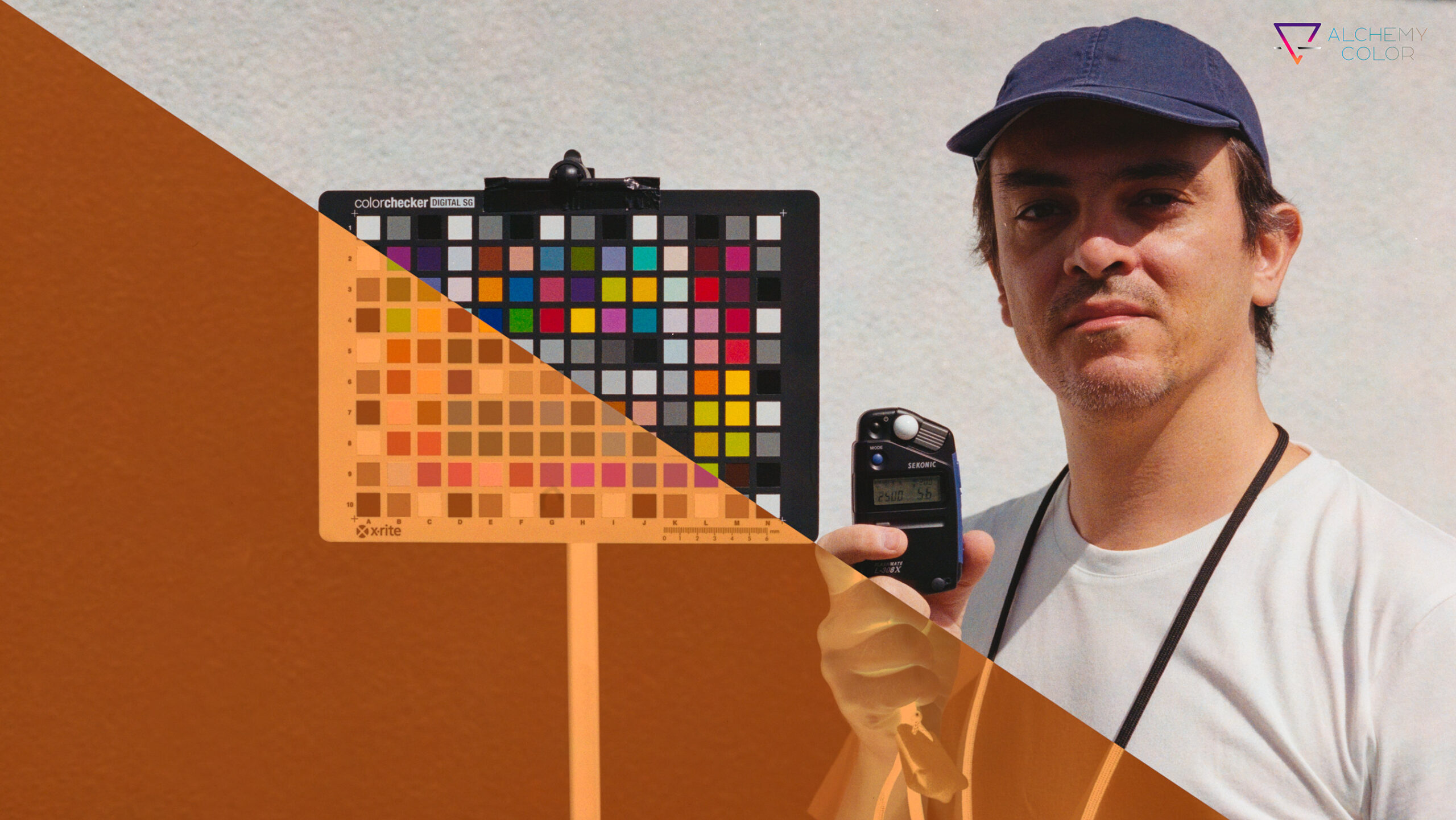
- To solve this mismatch, at least one element in the image pipeline must improve color separation. For the universal method presented in my video, I chose an iPad as a backlight. As seen in the measurements from my radio spectrophotometer, the light emitted from this screen closely matches the light source of a popular Fuji SP3000 film scanner. This choice of backlight will handle color separation needed for a good film scan with a digital camera.
- The universal method uses Adobe standard as DNG camera profile. This is a general-purpose profile that handles color separation in broad strokes, hence the need for a light source that preemptively takes care of that requirement.
- The color separation aspect of the specialized method relies on the virtues of good profiling. When using a very accurate DNG color profile for a specific camera, I was able to use continuous spectrum light sources to illuminate the negative. Extensive testing showed me that this was the most accurate method.
- Many film enthusiasts only want automated film scans and just leave the negative behind.
- Color negative film captures light linearly. The famous S curve of film is an attribute of the printing process but not from the negative itself. It’s the added contrast that makes images pop.
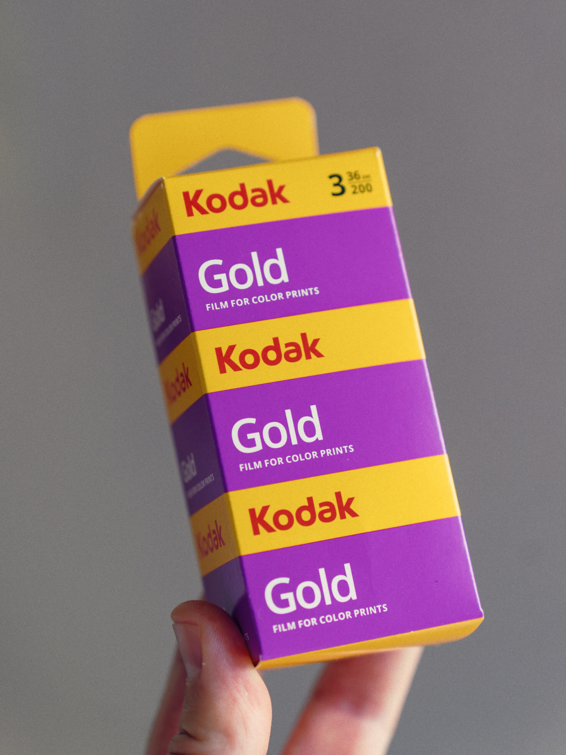
- Kodak Gold 200 is often described as a warm film, but I didn’t find any evidence of this except for a boost in yellows and oranges. The film’s red, green, and blue channels remain equidistant from deep blacks up to peak whites, making it neutral across its dynamic range.
Home scanning can be really, really good
And accurate too.
I decided to approach the color negative under the guise of color accuracy, as explored previously with my camera calibrations. If I kept every step as precise and well informed as possible, how accurate would the inverted negative be?
I addressed this question from the angle of artwork reproductionby focusing on the following: Best light source, Accurate exposure, Consistency, Camera profiling, Linear contrast, Wide gamut color space.
After having a good TIFF file with the photographed negative, it was time to invert it. This whole project would be meaningless without the work of Aaron Buchler who devised a mathematically accurate film inversion method using Photoshop.
The Specialized Method described in the tutorial video can achieve inversions with a DeltaE 200 of 2.84 on a ColorChecker SG. Values around 2.0 are considered very good. This is a testament not only to the accuracy of the method but also to the colorimetry of Kodak Gold 200.

Did anyone say film emulation?
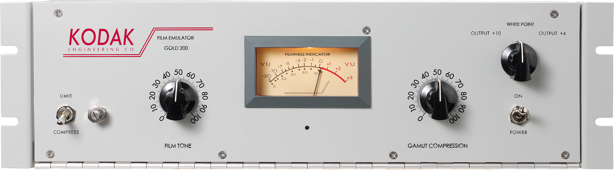
While the image seen above is an obvious joke, it helps us establish a working metaphor about the nature of the analog signal path. That white rack-mount audio device is an LA-2A Leveling Amplifier, AKA a compressor. Wikipedia says that “The LA-2A has the ability to preserve the impression of performance dynamics while performing extreme level management—a sonic character that makes it sought after by many recording engineers, particularly for use on vocals and bass guitar.” This reminds me of what analog photography does to light, it compresses and amplifies.
The transition from analog to digital audio underwent the same growth pains as photography with the recording medium, editing environment, and reproduction systems. Many engineers prefer vintage tube microphones; multitrack mixing in a studio is mostly digital nowadays but often relies on adding analog devices in the signal path to add character to the sound, and as for reproduction, some prefer the sound of vinyl to digital.
I think the same can be said about digital photography. My approach to film is that it can be added to the digital signal path as a compressor. Indeed, it compresses and darkens high-saturation colors, reminiscent of subtractive synthesis color models and devices, and all of this contributes to what we like about most sensory experiences: That it feels nice.
With this in mind, I extracted the positive color of the inverted negative with the most well-informed process I could come up with. The result is an XMP profile that is ingested into the Adobe Camera Raw image pipeline, allowing for extensive edits without being locked into a finished look. The emulation is indeed subtle as we saw before in the color matching metrics but noticeably enough to be amplified into a desired look.
Here’s a box of Kodak Gold 200 photographed with a digital camera emulated to Kodak Gold 200. This before/after slider reveals some of the traits Kodak Gold 200 negative film is popularly known for:
- Saturated and bright yellow and orange.
- Caucasian skin tones often sway towards orange.
- High saturation colors such as red become darker as a consequence of the subtractive color model of film and print paper.


So, can digital actually look like film?
Color is only part of the picture (pun intended). Texture is super important too, so here are some examples of both small sensor old digital cameras with the emulation applied. This emulation likes noisy sensors as it takes advantage of natural chroma noise, mixed with custom optimization masks that complete the film look. Dense, saturated colors are also a natural result of the subtractive synthesis process. Deep reds and blues that don’t clip into a flat color come out naturally with this emulation.


Emulating the developed negative is a game changer.
In my opinion.


The most fundamental representation of a color negative happens after the film is developed. If everything goes well with the film stock and development, then emulating a developed negative would bypass any arbitrary transformation, allowing for an accurate starting point for subsequent inversions. But how is this even useful in a digital world? Is it even accurate?

An average DeltaE 200 of 0.77 is pretty accurate…
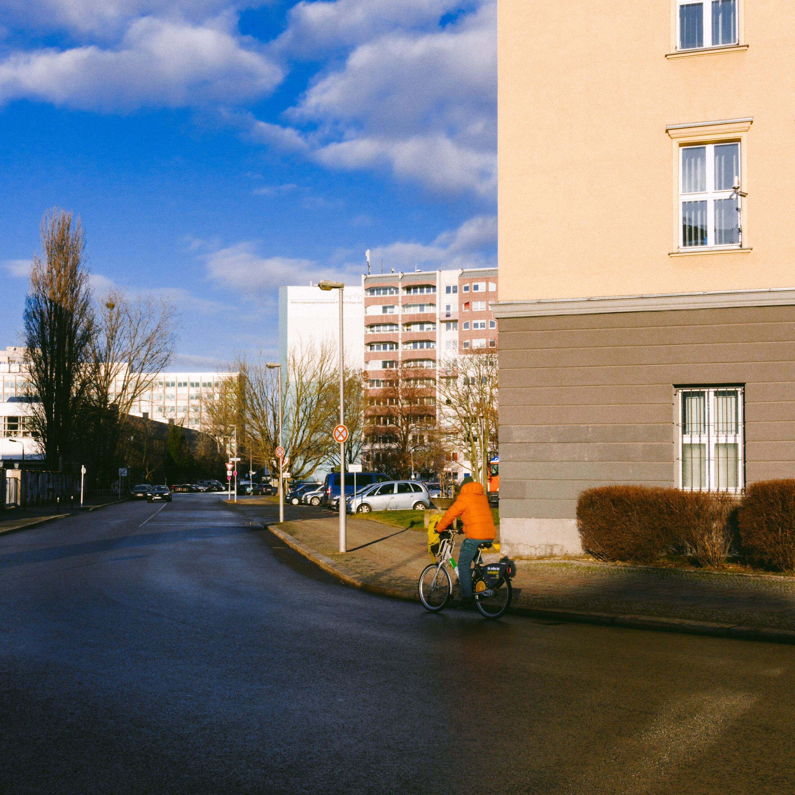
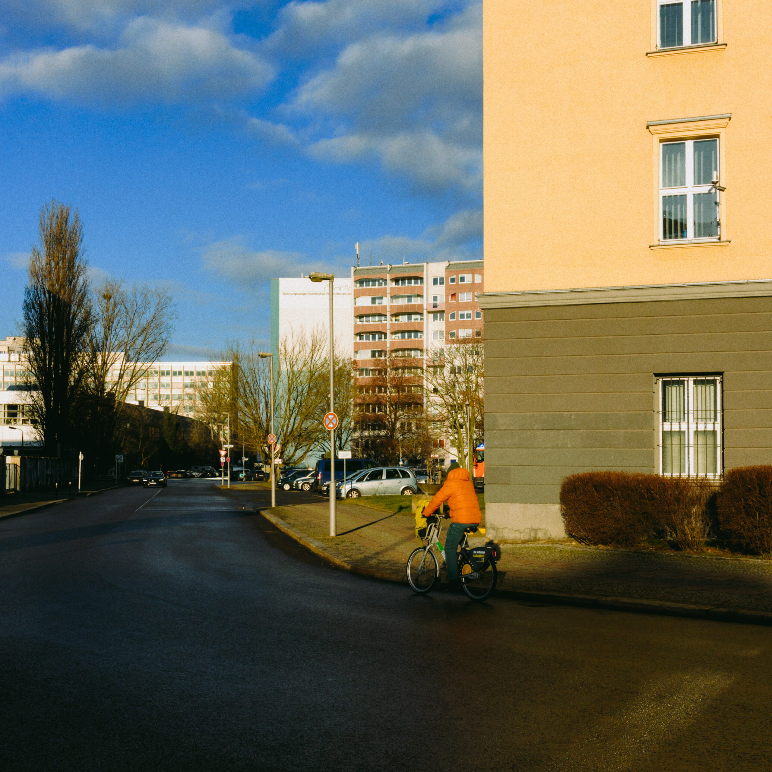
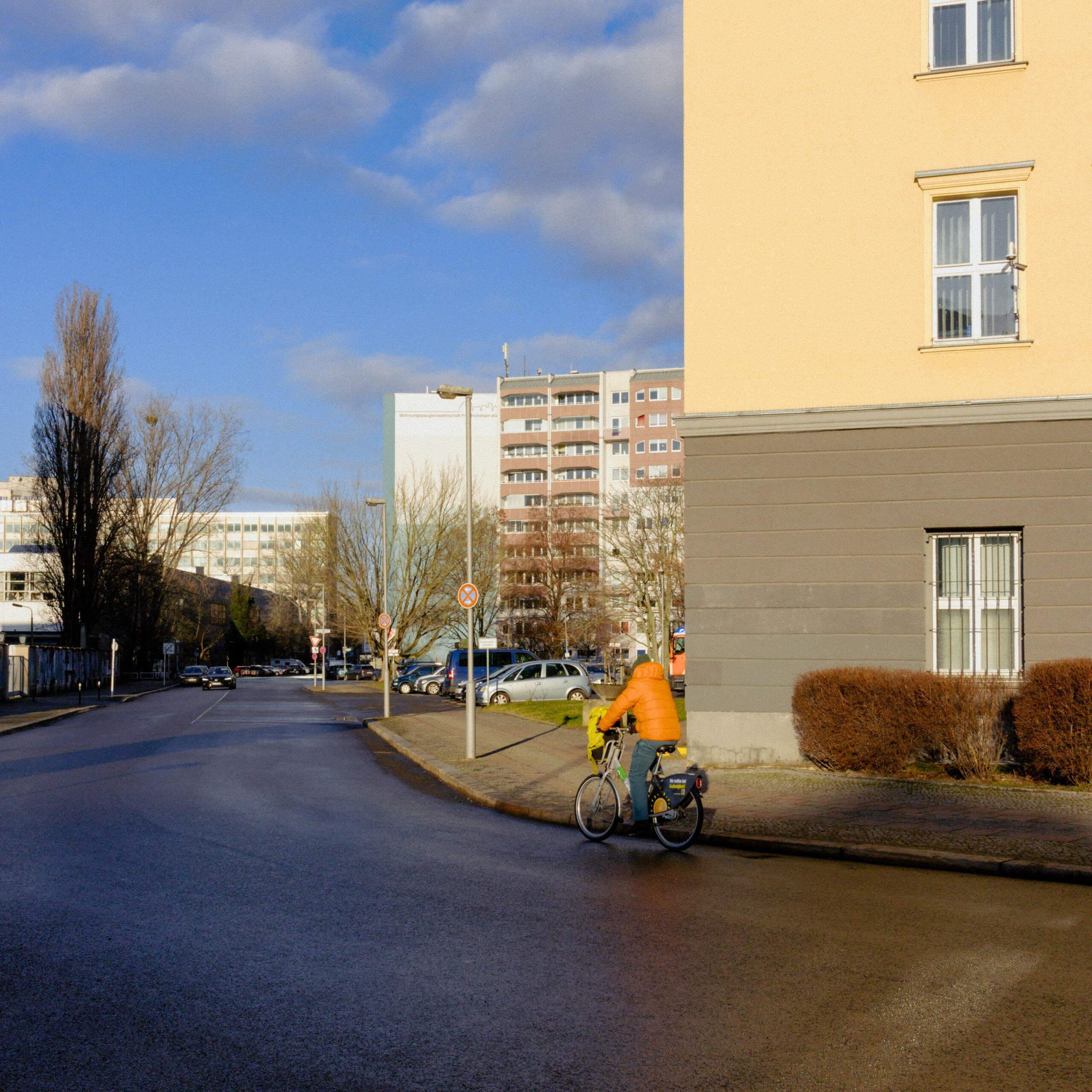
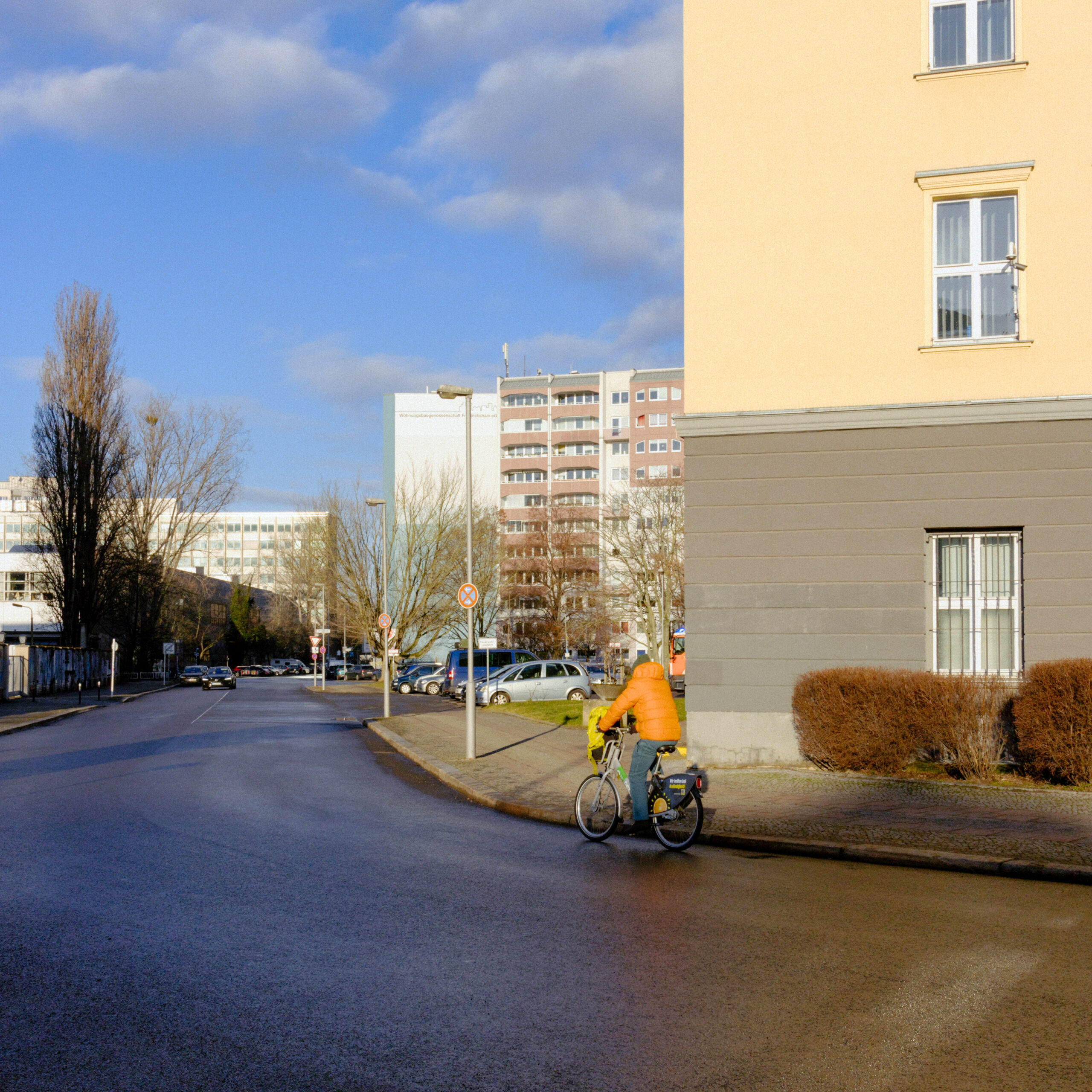
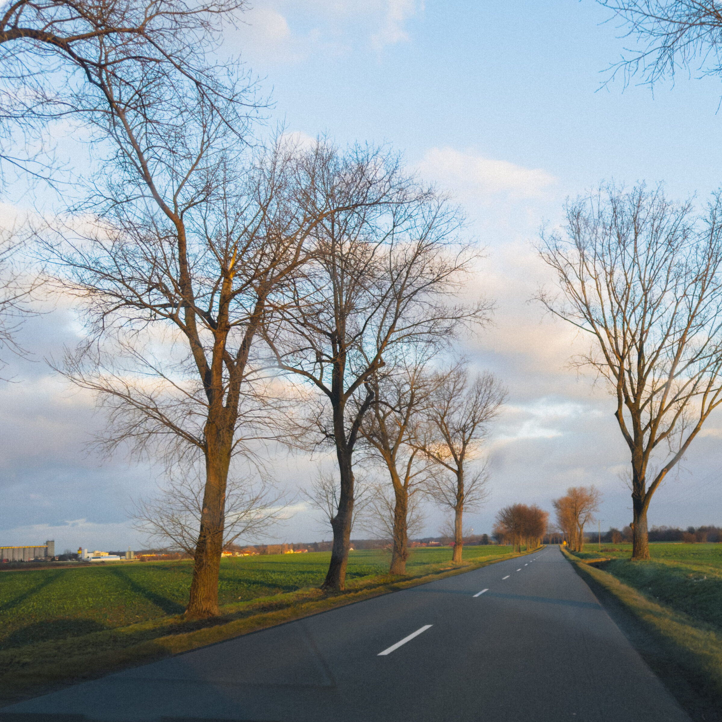
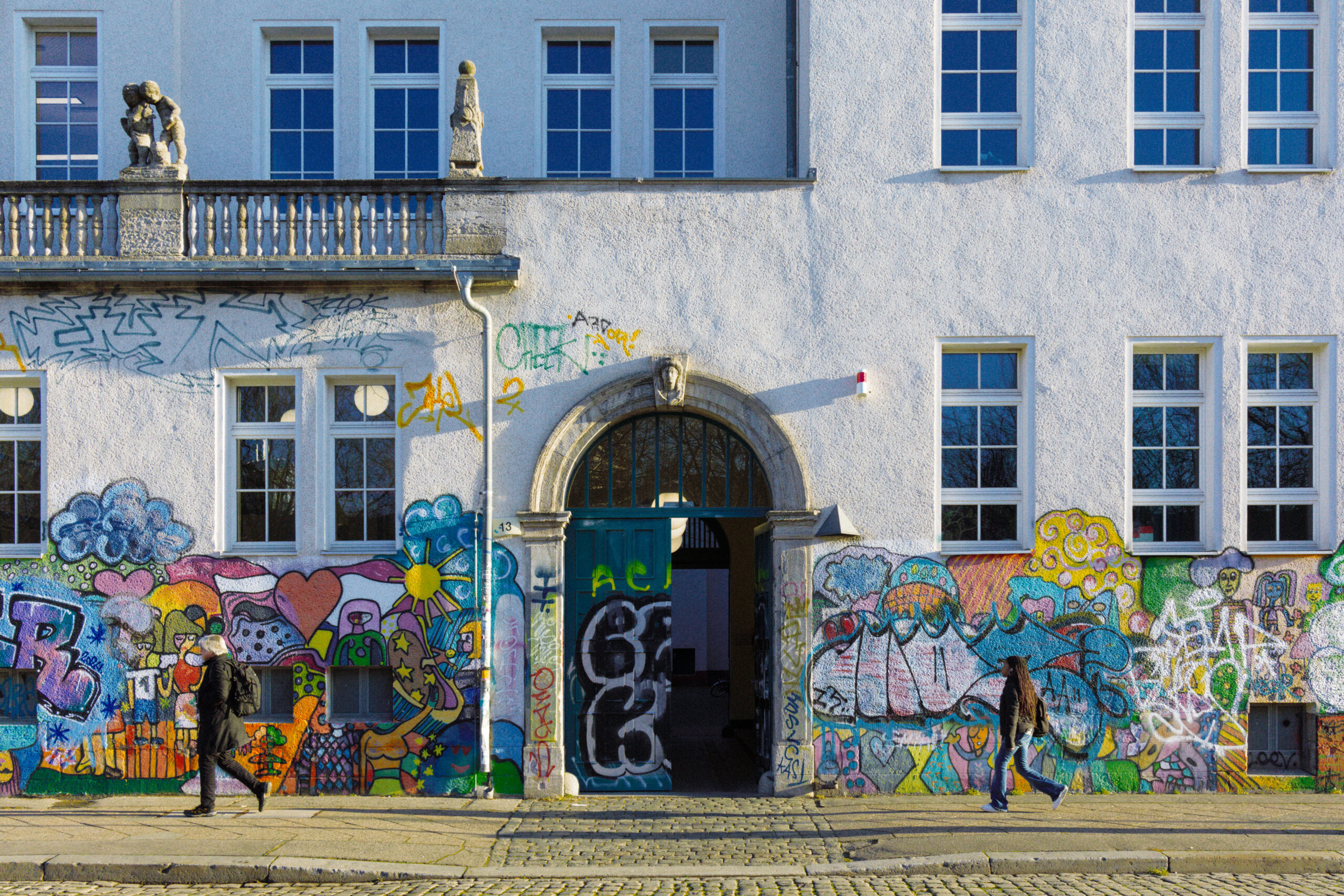
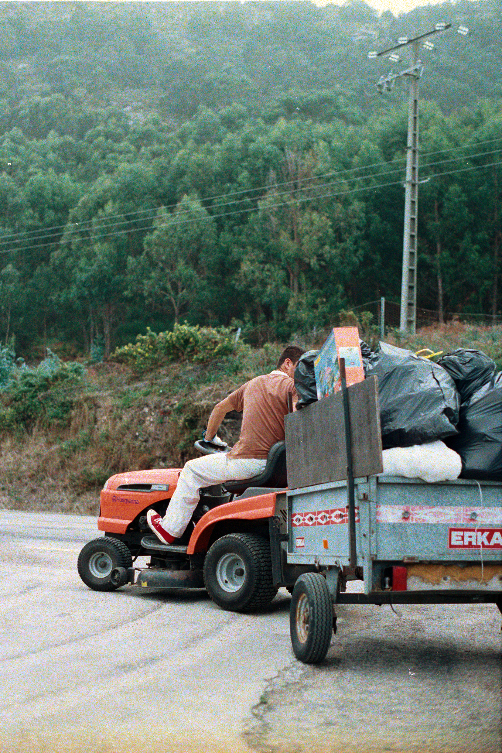
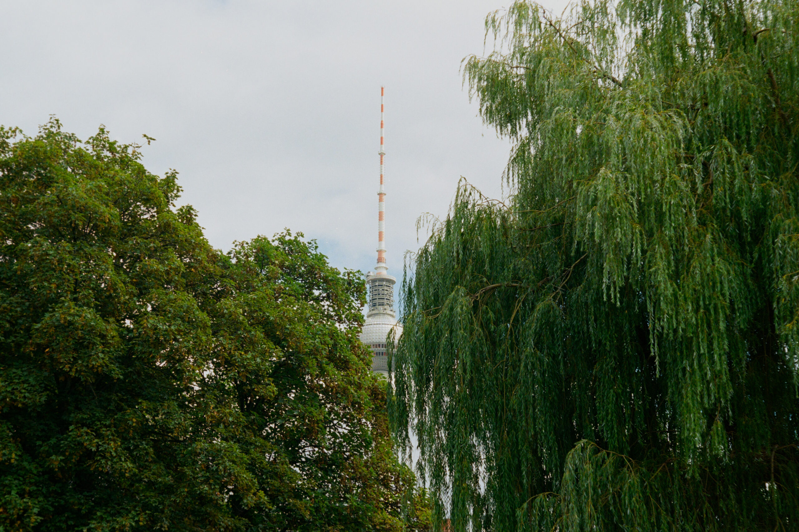
Ok, now what can I do with this orange negative image? This solution in search of a problem taps into the flexibility of both our own inversion method and the usage of plugins such as Negative Lab Pro. Let’s take this candid postcard of a street corner in Berlin and invert it to Kodak Ultramax 400. The camera used was a Canon EOS M6 MKII with a 22mm f/2 lens. Download the emulated TIFF here and try inverting it yourself.
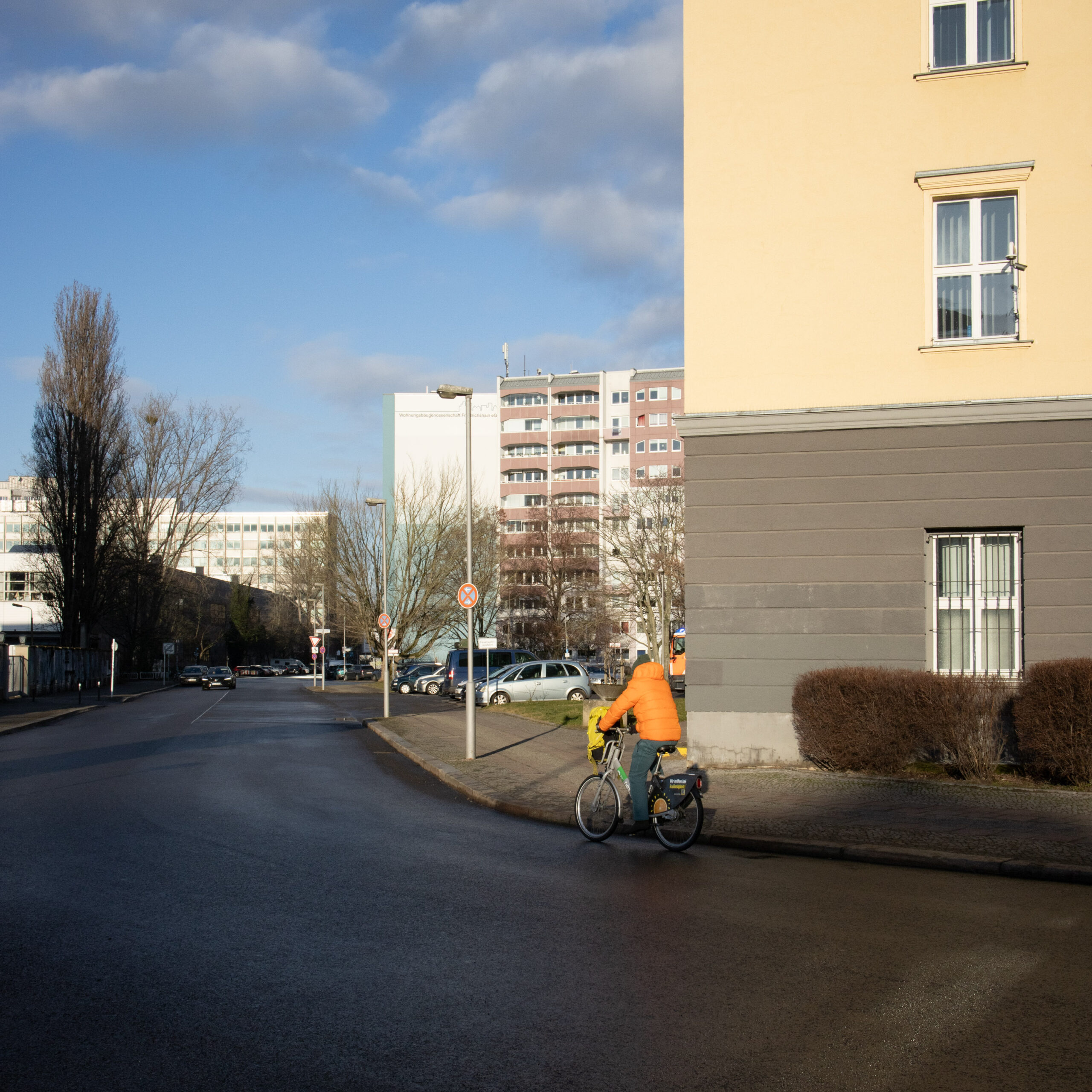

I first adjust white balance, exposure and apply the negative emulation. Then I export a 16 bit TIFF in REC.2020 or any other wide gamut color space, import it back into Lightroom and open Negative Lab Pro. The extensive editing options in NLP allow for infinte looks. Here are 6 of them. Click on any image to zoom in.


So, can we see the forest for the trees now?
Here are two photographs. One was taken with a Canon EOS 50e + EF 50mm f/1.8 with Kodak Gold 200, developed and scanned with a Sony A7IV with 33 megapixels, a 1:1 macro lens, and inverted manually with our specialized method. The other is a digital image made with a 6-megapixel CCD Konica-Minolta 5D, emulated to negative, exported as TIFF, and processed with Negative Lab Pro.


Gallery
To conclude, here’s a gallery showcasing both film and emulated digital photographs. Take a guess which is which. Click on each photo and zoom in 1:1. Comment down below on which you think are film and which are digital emulations.


The Double-Edged Sword Of Digital Imaging
Essay
In this essay I will explore some questions behind the nature of analog and digital media and how it relates to our sensorial nature.
“For a long time, many people have thought, ‘Well, film has this S-curve kind of thing, it must be some sort of limitation of the photochemical process’. It isn’t. It was designed into the photochemical process. Eastman Kodak for years actually hired more psychologists than chemists for a period of time. They would go around and research this, about what people like; and all of these S-curves with rolling off of the highlights and shadows was purposefully built into the product.”
– Joshua Pines, colour scientist
The Pursuit Of A Certain Type Of Warmth
We often appreciate how an image looks on film or how an analog recording of a song sounds, describing this sensation as “warmth.” This brief yet powerful term conveys much about the nature of memory, analog and digital media, and the experience of reproduction. While digital signal processing allows for infinite, non-destructive transformation of data, many viewers find it lifeless and unmoving.
I believe most people prefer a veiled reality over an accurate representation of the original phenomenon. Analog media—whether audio, film, or stills—charm us by providing a protective layer between us and the original event. Characteristics such as tape hiss, visual grain, vinyl crackle, dust on film, tape headroom compression, highlight roll-off, audio frequency non-linearities, and color skews reveal the similarities across analog mediums.
These features are inherent shortcomings of the analog medium. However, they play a significant role in creating that elusive sense of “warmth,” a quality that eludes precise description and is often used casually as a quick label.

The medium massages us
The media is the message
If all we have are memories and the recorded etchings of those memories, the recording medium becomes an active agent in reliving the original event. The aforementioned sense of warmth serves as a veil, protecting us from what might otherwise be perceived as a “boring” image. Uninteresting images can become compelling through the presence of this analog “warmth.”
William Eggleston’s work exemplifies this. His 5×7 large format direct contact prints are stunning, even though his subjects often were not. The medium can evoke memory as much as the message it contains. Walter Benjamin’s words come to mind when he suggests that the medium massages the spectator.

High Fidelity Sounds
The technicalities of sound reproduction
The term “high fidelity” in music reproduction describes the desire to be immersed in a sensory experience as close to the musician’s or studio’s intent as possible. The commercial incentive is clear: a better-sounding system is one that doesn’t modify the original sound.
While the direct output of a microphone is just a low voltage facsimile of the real thing, an analog or digital picture is more abstract. Consider a film negative or a raw digital file—an orange-tinted inverted image or a matrix of numbers. This information needs to be transformed to look real, while sound just needs to be amplified. Positive film can be excluded from this comparison.
This raises the question of whether the faithful reproduction of color relies more on processing than on the inherent virtues of the capture hardware.


High Fidelity Images
The technicalities of image reproduction
In the days of analog film, some products were marketed with terms like “Reala.” This film contained a fourth color layer that promised better compatibility with fluorescent lights and a more realistic-looking image. Kodak, for instance, claimed that their new emulsion could “photograph the details of a dark horse in low light.”
These marketing strategies aimed to differentiate products by emphasizing fidelity, much like the audio industry had done before.
Digital capture and editing brought about the possibility for endless non-destructive manipulation. Closer-to-reality reproduction became attainable, but this virtue was never advertised with the same vigor as the inherently flawed, moving target of chemical processes.
In the digital realm, we have Canon’s Faithful color profile and many “Natural” profiles by other manufacturers, but the concept of high-fidelity imagery was never widely promoted. One exception is Hasselblad with their Natural Colour Solution (HNCS).
Monitors, on the other hand, emphasize faithful color reproduction. Technical measurement results are made public to appeal to professionals who need to trust their color accuracy.

The need for realistic looking images
Different cameras can look the same in post
Camera brands offer different looks in their models to attract photographers who want to see the world in a specific way. While this is true for in-camera processing, RAW files allow for extensive manipulation of the original signal.
In-camera color processing and digital “developers” each have a specific look. Out of the box, no JPEG file straight from the camera or RAW file with default settings is colorimetrically accurate. Some come closer than others, but generally, brands still shy away from removing that layer of “warmth.”
Colorimetrically accurate images can be boring, but the same image can be improved in post-production, much like Kodak’s S curve. Professional photographers need assurance and predictability in a product that removes the look of a camera sensor in the imaging pipeline.
Alchemy Color Calibrations stems from this concept that the tools in raw image editing should work on a realistic baseline rather than a pre-cooked image that seems finished with one click.

A fresh shart
Alchemy Color stems from an intense desire to achieve correct reproducibility with digital images. Faithfulness in reproducing reality is a moving target that eludes aesthetic trends as it stands on its own as a measurable, empirical process. My passion for systems of reproduction (audio/video/photo) became a profession 15 years ago. Since then, having a dependable set of tools for color transformations has been hard. Most of the options out there are arbitrary, trendy or plainly wrong. With this in mind I decided to make my own.
“Photography is not about the thing photographed. It is about how that thing looks photographed.”
Garry Winogrand
I want to see what my eyes see, not necessarily what the camera internal signal processing or the raw developer decides it’s supposed to look like. If I want to see that thing photographed, I want to minimise the color decisions along the way, hence the importance of calibration. I want to have control over the color look of my images. If I want to see the camera, then camera body emulations come to mind. Maybe I want a Sony camera producing images that look like a Fujifilm JPEG. This is also possible and will come out as a product later this year. The cameras we’re eying right now are: Fujifilm film emulations and Olympus E-400 CCD emulations.
Alchemy Color is the toolset that I wish I had found earlier in my photography career. Now, it’s here!